Getting started
Install
Use Node.js 20+ and a React project with CSS bundling:
npm install react@19 react-dom@19 lucide-react@0.468 \
  "https://github.com/MolarVerse/PQDesign/releases/download/v0.1.3/molarverse-pq-design-0.1.3.tgz"
Commit package.json and package-lock.json; reinstall with npm ci.
Render a control
Put <div id="root"></div> in the HTML and this in the client entry point:
import { useState } from "react";
import { createRoot } from "react-dom/client";
import { Field } from "@molarverse/pq-design";
import "@molarverse/pq-design/styles.css";

function TemperatureControl() {
  const [temperature, setTemperature] = useState("300");

  return (
    <Field label="Target" unit="K">
      <input type="number" min="0" value={temperature}
        onChange={(event) => setTemperature(event.target.value)} />
    </Field>
  );
}

createRoot(document.getElementById("root")!).render(<TemperatureControl />);
Field connects the label to its input. State and numeric validation stay
in the application. Import application CSS after styles.css.
Dialog and search
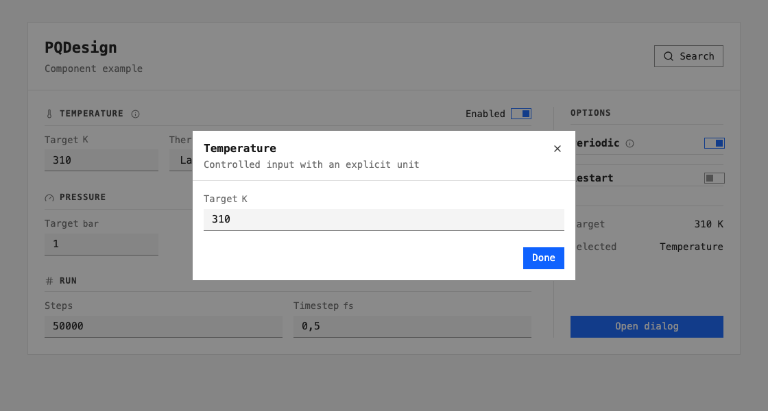
The component example uses the released controls:
Action |
Control |
Behaviour |
|---|---|---|
Edit Target or Thermostat |
|
Change application state |
Change Enabled, Periodic or Restart |
|
Return a boolean through |
Hover or focus the information icon |
|
Show supplementary text |
Open dialog |
|
Edit Target; Done, Escape or Close ends the dialog |
Search |
|
Filter commands; arrow keys select, Enter runs, Escape closes |
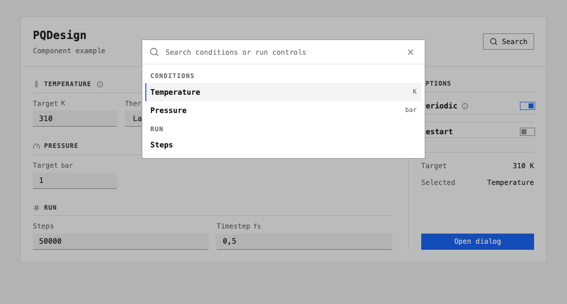
Dialogs and tooltips use the browser DOM. IBM Plex Mono is the preferred font; supply its font files when that exact face is required.
Existing controls and documentation
Import tokens.css for your own controls. It supplies variables without
global component selectors. For manuals, load that versioned token copy
before docs/_static/pq-docs.css. The shared adapter maps Furo variables on
body and retains Furo’s dark palette. See Reference
for the mapping and gallery reproduction.