Reference
Package exports
Import |
Contents |
|---|---|
|
React controls, their exported types, |
|
Token stylesheet, base rules and component CSS |
|
Generated CSS custom properties |
|
Source design values |
Controls
Export |
Required properties |
Use |
|---|---|---|
|
|
Labelled input; optional |
|
|
Select control; options contain |
|
|
Boolean control; optional |
|
|
Section of related fields; optional |
|
|
Lucide icon and heading; optional fields, |
|
|
Native dialog; optional |
|
|
Supplementary text shown on hover, focus or click |
|
|
Searchable dialog; optional |
Controlled values are returned through onChange. The consumer updates
state. Closing a dialog calls onClose; the consumer sets open to false.
Type exports are FieldProps, ChoiceOption, ChoiceProps, ToggleProps,
GroupProps, ConditionRowProps, Command, CommandPaletteProps and
SearchableCommand.
Command search
Commands require id, group, label and a run callback. Optional
detail, hint and keywords provide searchable text. featured includes
a command in the empty-query list; current marks the active choice;
disabledReason prevents execution and supplies the displayed reason.
import { rankCommands, type SearchableCommand } from "@molarverse/pq-design";

const commands: SearchableCommand[] = [
  { id: "temperature", group: "Analysis", label: "Temperature", featured: true },
  { id: "energy", group: "Analysis", label: "Energy", keywords: ["potential"] },
];

const matches = rankCommands(commands, "potential", ["Analysis"]);
// matches[0].id === "energy"
Search normalizes case and accents, then matches words in labels and search
text. Every query word must match. rankCommands returns the original
objects ordered by score, group order and original position. The palette
displays those results in groups; groups absent from groupOrder come last.
Arrow keys move selection, Enter executes, and Escape closes the palette.
Tokens
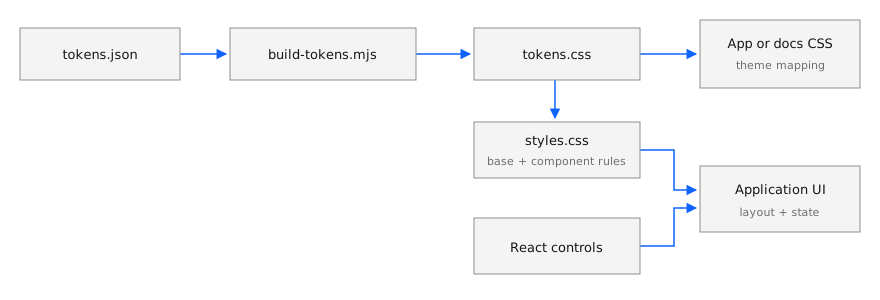
Edit tokens.json, then regenerate src/styles/tokens.css. JSON sections
map to CSS variables as follows:
JSON section |
CSS naming |
Example |
|---|---|---|
|
|
Font stack |
|
|
|
|
|
|
|
|
|
|
|
|
Use semantic roles such as --ink, --muted, --surface, --border,
--accent, --focus-color, --success, --warning and --danger. The token
stylesheet also sets color-scheme: light. The base stylesheet supplies a
two-pixel keyboard focus outline and default typography.
Change and release
From the repository root:
npm ci
npm run tokens
npm test
npm run build
npm pack
node scripts/verify-package.mjs molarverse-pq-design-0.1.3.tgz
Commit regenerated CSS with token changes. When exports, token values or
public component classes change, update package.json and the lockfile
version. Use that version in the archive verification command.
The release workflow checks that a v<version> tag matches package.json
and points to a commit on main. It verifies the standalone archive, then
publishes the .tgz and SHA256SUMS to GitHub Releases. Consumers update
their archive URL and lockfile together. PQDesign versions are independent
of the Python application versions.
Documentation styling
Copy the versioned tokens.css, shared docs/_static/pq-docs.css,
pq-docs.js and pq-logo.png into the manual’s static assets;
record their source and checksum. Load tokens first. The script makes
unlinked figures open at full size; the logo also appears in narrow headers.
Furo supplies navigation and search. The adapter overrides variables on
body, where Furo defines them:
body {
  --font-stack: var(--mono);
  --font-stack--monospace: var(--mono);
}

body[data-theme="light"] {
  --color-foreground-primary: var(--ink);
  --color-background-primary: var(--surface);
  --color-brand-primary: var(--accent);
}
html_logo = "_static/pq-logo.png"
html_favicon = "_static/pq-logo.png"
html_css_files = ["pq-tokens.css", "pq-docs.css"]
html_js_files = ["pq-docs.js"]
The complete adapter also covers automatic light mode and retains Furo’s
dark palette. Keep application layouts and font files with the consumer.
styles.css includes global selectors such as body, .notice and
.command-palette; tokens.css is the suitable input for an existing theme.
Reproduce the gallery
Copy the gallery files into an empty directory, then run:
npm install react@19 react-dom@19 lucide-react@0.468 \
  "https://github.com/MolarVerse/PQDesign/releases/download/v0.1.2/molarverse-pq-design-0.1.2.tgz"
npm install --save-dev esbuild@0.25.12
npx esbuild gallery.tsx --bundle --format=esm --jsx=automatic --outdir=dist
cp gallery.html dist/index.html
python3 -m http.server 9348 --bind 127.0.0.1 --directory dist
Open http://127.0.0.1:9348. The figures show these released controls at 1120 × 600: initial state; Target changed to 310 K with its dialog open; and command search open. Capture details are in the image manifest.